Cracker Barrel’s Logo Swap Sparks a Southern-Fried Uproar

A Nostalgic Icon Goes Modern
Picture this: you’re pulling off the interstate, craving the warm hug of Cracker Barrel’s biscuits and gravy, only to find the familiar “Old Timer” logo—a grizzled gent leaning on a barrel—has been replaced by a slick, text-only design that screams “corporate makeover.” On August 20, 2025, Cracker Barrel Old Country Store, the Southern comfort food haven, unveiled its first major logo overhaul in nearly half a century, ditching the 1977 emblem for a minimalist wordmark set against a yellow, barrel-shaped backdrop. CEO Julie Felss Masino, a fast-food veteran, called it a bold step to “refresh” the brand and woo younger diners as sales slump. But the move has set the internet ablaze, with fans crying foul, branding the change “woke,” and calling for boycotts that could rival a country music feud. Has Cracker Barrel traded its soul for a shiny new look, or is this just a tempest in a teapot? Let’s dig into the drama shaking up America’s favorite roadside retreat.
The Heart of Cracker Barrel
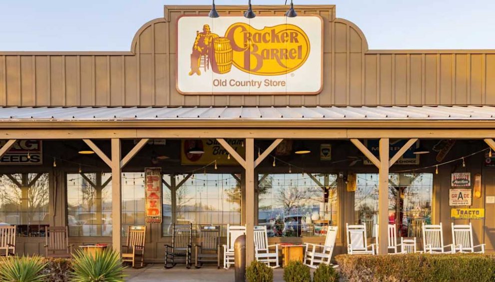
Since 1969, Cracker Barrel has been a slice of Americana, its 660 locations dotting highways from Tennessee to Texas with rocking chairs, pegboard games, and walls dripping with vintage charm. The menu—think chicken-fried steak, meatloaf, and those heavenly buttermilk biscuits—draws families, retirees, and road-trippers chasing a taste of yesteryear. The original 1969 logo was simple text, but in 1977, the chain embraced the now-iconic “Old Timer” by a barrel, a symbol of homespun hospitality that’s as much a part of the experience as the checkerboard tabletops. For decades, Cracker Barrel’s mantra, “Pleasing People,” has resonated with its core crowd: older, rural diners who see the chain as a cozy time capsule.
But times are tough. Post-pandemic dining shifts have hit Cracker Barrel hard, with declining foot traffic and a stock price that’s taken a beating. Enter Julie Felss Masino, the new CEO with a resume boasting Taco Bell and Kendra Scott. In 2024, she launched a three-year plan to make Cracker Barrel “more relevant,” rolling out modern farmhouse-style remodels at 40 locations, new dishes like hashbrown casserole shepherd’s pie, and a splashy New York City pop-up event on August 21, 2025, featuring country star Jordan Davis. The logo redesign, part of the “All the More” campaign, was meant to seal this transformation, with Masino promising it “celebrates our roots while looking to the future” with colors inspired by “farm-fresh eggs and biscuits.”
The Redesign That Lit a Fuse
The new logo is a clean break from tradition. Gone is the “Old Timer” and ornate script; in their place, a bold, modern typeface on a subtle barrel-shaped background in familiar gold and brown hues. Cracker Barrel insists it’s a nod to the original 1969 wordmark, with CMO Sarah Moore declaring, “Our values haven’t changed—hospitality, craftsmanship, and warmth are still at our core.” But fans aren’t buying it. Social media exploded with outrage, turning the redesign into a cultural flashpoint. On X, @GuntherEagleman raged, “Cracker Barrel just TORCHED their brand. What are they thinking?” alongside a viral comparison of the old and new logos. TikTok users piled on, with one calling the remodeled stores “a sterile Hobby Lobby knockoff.” The hashtag #GoWokeGoBroke trended as conservative influencers, like @AlexBruesewitz, accused Masino of “erasing” Cracker Barrel’s heritage to chase “woke” trends.
The backlash echoes earlier controversies, like the June 2025 uproar over Cracker Barrel’s Pride Month posts, which some fans labeled a betrayal of its conservative-leaning base. On Reddit’s r/Design, users slammed the logo’s simplicity, with one quipping, “It’s like they hired a first-year design student to slap text on a yellow blob.” Comparisons to Bud Light’s 2023 boycott over a transgender influencer campaign surfaced, with @amuse posting, “Cracker Barrel’s new DEI-hire CEO is decolonizing the brand. Say goodbye to nostalgia.” The sentiment? The chain’s attempt to shed its “old-fashioned” image feels like a middle finger to the loyalists who cherished it.
Voices of Support Amid the Storm
Not everyone’s grabbing pitchforks. Some customers and employees praise the changes, noting remodeled locations feel brighter and more welcoming. “The food’s the same, the rocking chairs are still there—what’s the fuss?” one X user wrote. Masino, appearing on Good Morning America, claimed “feedback has been overwhelmingly positive,” citing higher check averages and happier staff at updated stores. The “All the More” campaign leans into this, with new menu items like brown sugar lattes and a Jordan Davis-curated playlist to lure younger crowds. The New York pop-up, complete with a faux porch and peg games, aimed to prove Cracker Barrel could vibe with urban Millennials and Gen Z.
Still, the naysayers dominate the narrative. “It used to feel like Grandma’s kitchen; now it’s like eating in a gentrified barn,” one TikTok user lamented, racking up thousands of likes. Another X post jabbed, “Cracker Barrel’s new logo looks like it was designed by someone who hates Cracker Barrel.” The chain’s core demographic—older, rural, and less likely to rage-tweet—may not share the online fury, but the vocal backlash from influencers and younger fans has turned the redesign into a PR nightmare.
The Stakes and the Future
Cracker Barrel’s gamble is clear: modernize to survive. With competitors like IHOP and Red Lobster also struggling, the chain needs to court younger diners without alienating its base. Marketing expert Bruce Clark from Northeastern University warns, “Nostalgia brands live or die by their authenticity. You can’t just slap a new logo on and call it a day.” While IHOP’s 2018 “IHOB” stunt survived its backlash, Cracker Barrel’s deeper cultural resonance makes this a riskier move. Only 40 of 660 locations are remodeled, with plans for more, but without clear sales data, it’s too early to call the strategy a win or a flop.
The controversy raises a bigger question: can Cracker Barrel stay true to its roots while chasing relevance? Fans fear the chain’s soul—those creaky rocking chairs, kitschy decor, and unpretentious charm—is being sanded down into something generic. “It’s not just a logo; it’s a vibe they’re killing,” one Reddit user wrote. Masino insists the core experience remains, but the online firestorm suggests otherwise. To quell the outrage, Cracker Barrel may need to lean into community engagement—perhaps free biscuits for loyalists or a nod to the “Old Timer” in future campaigns.
The Road Ahead
As the dust settles, Cracker Barrel stands at a crossroads. The redesigned logo, meant to signal a vibrant future, has instead ignited a battle over nostalgia and identity. Will fans forgive the chain and keep flocking to its porches, or will the boycott calls gain steam? For now, the internet’s verdict is harsh, with memes and rants painting the rebrand as a betrayal of everything Cracker Barrel stood for. But in the heart of every remodeled store, the biscuits are still warm, the peg games still wait, and the promise of comfort endures—if only the fans will give it a chance.
For the latest on Cracker Barrel’s rebrand saga, visit www.clickusanews.com.


